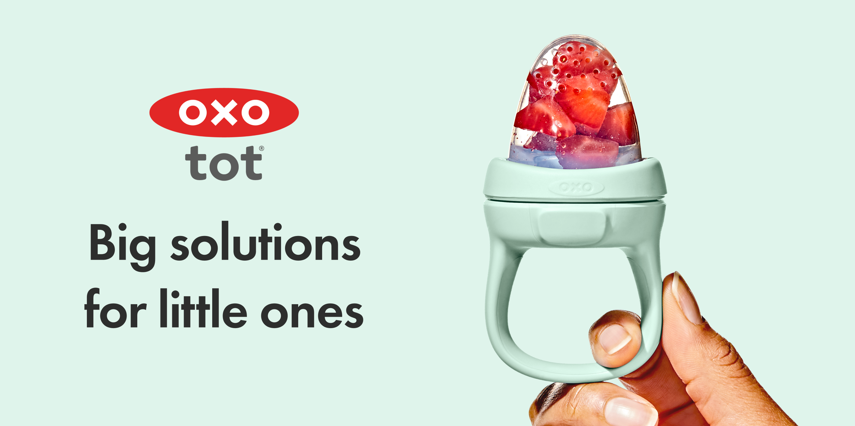
OXO Social Refresh (2025)
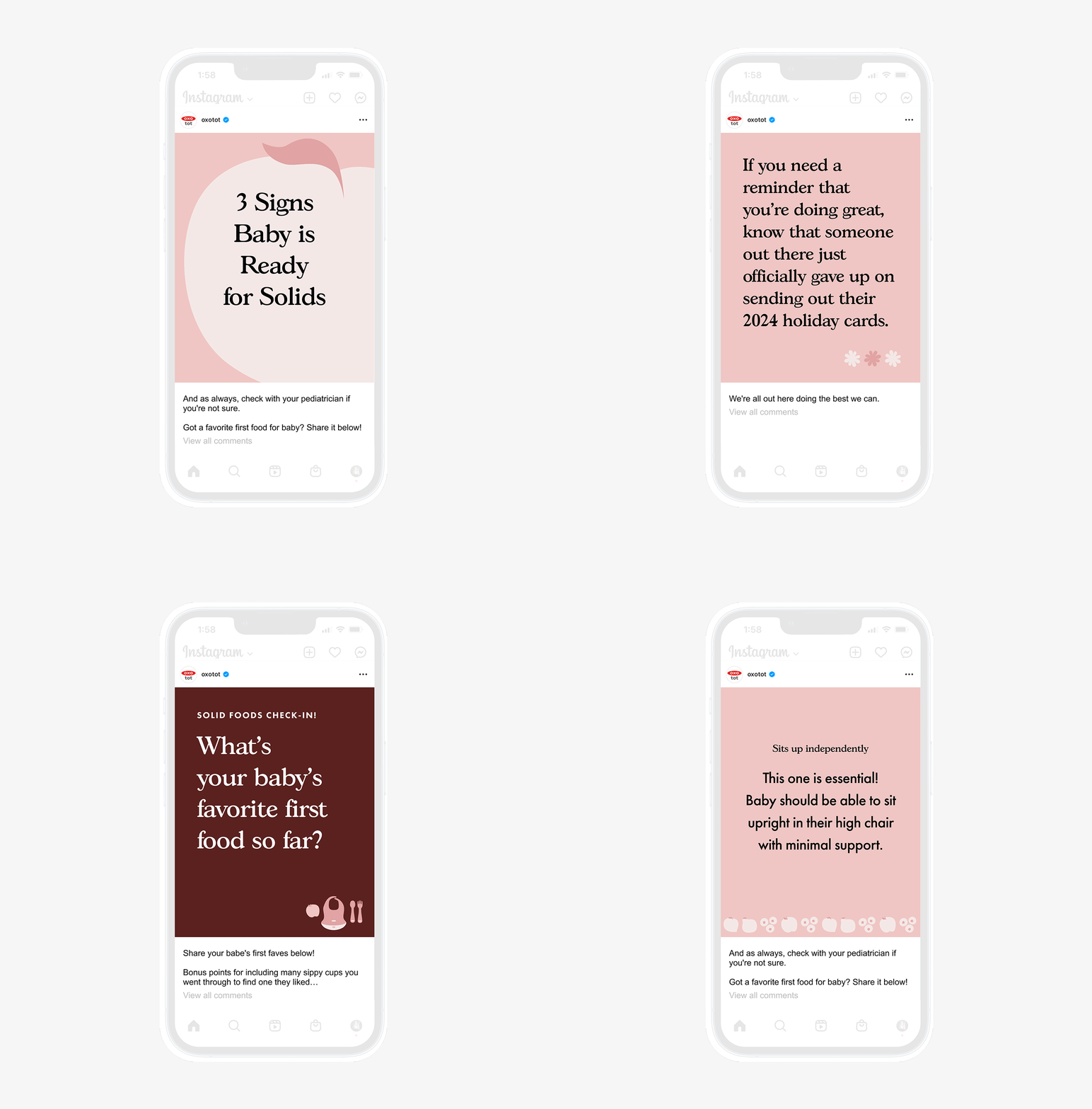
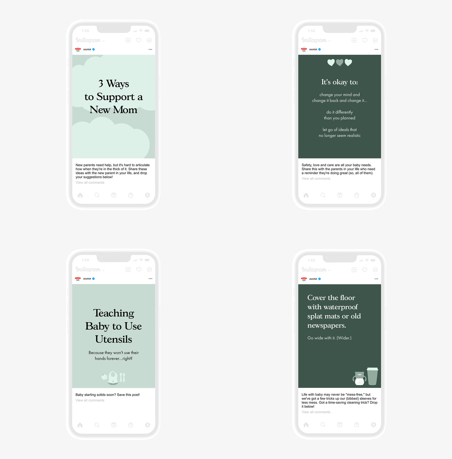
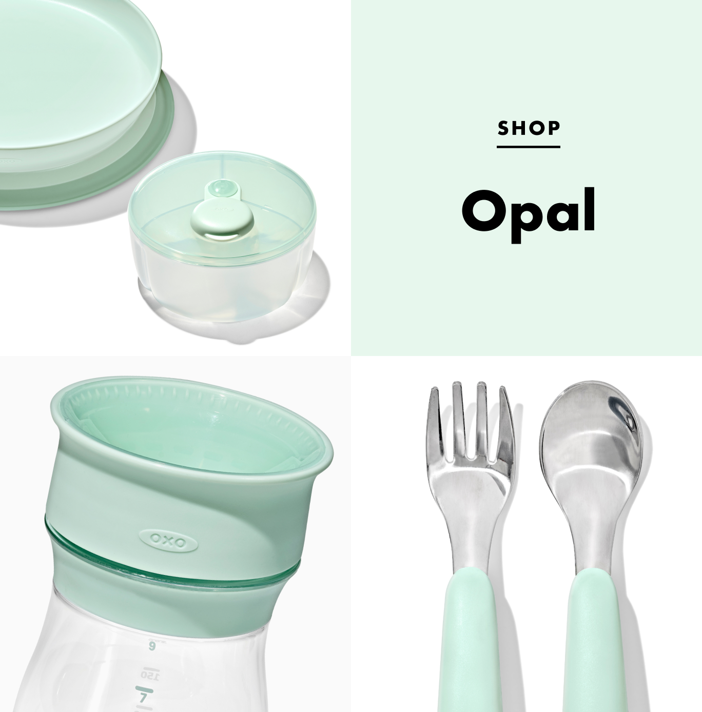
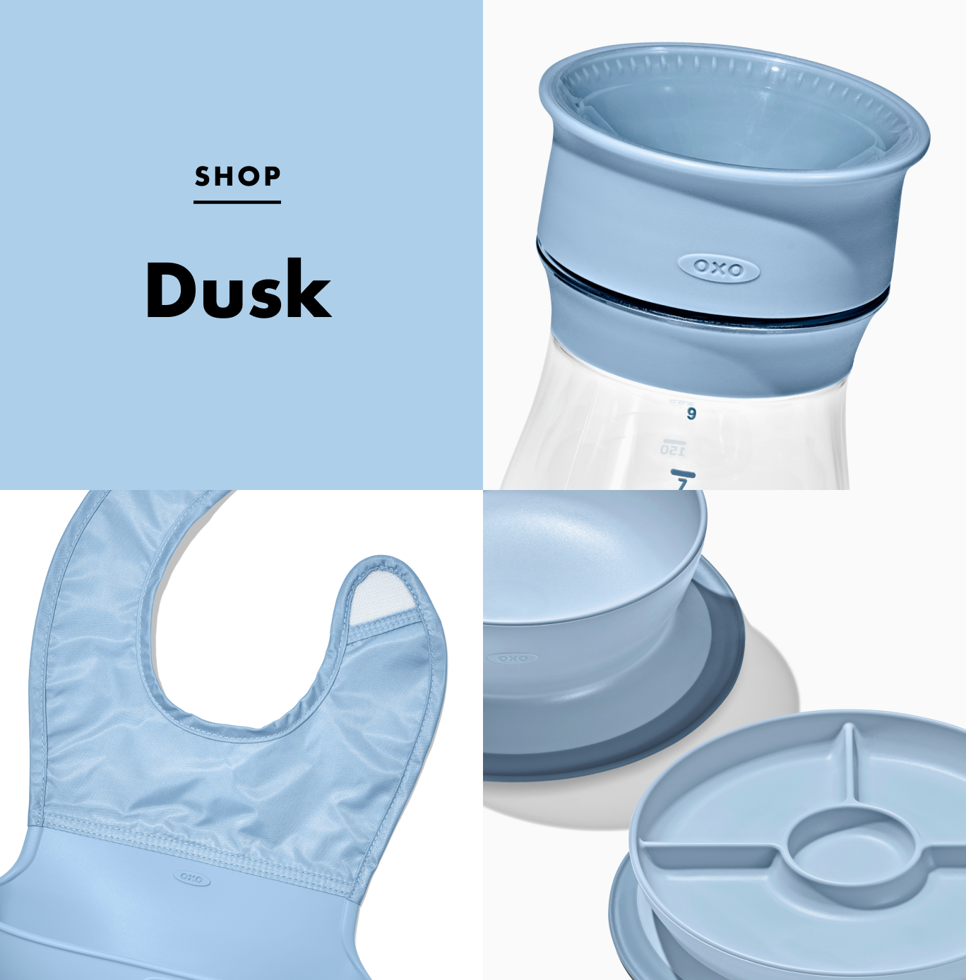
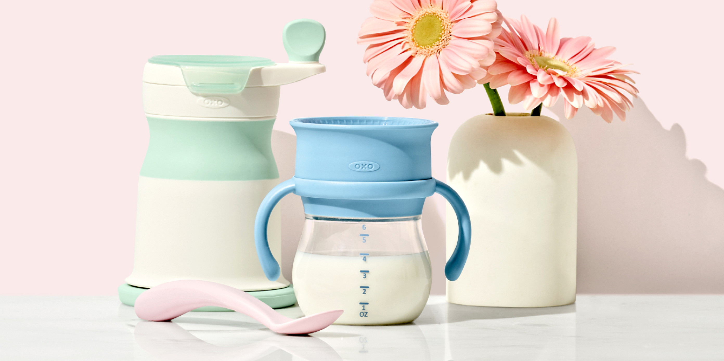
OXO Tot (OXO’s baby and toddler line) launched three new colors across key categories like Feeding & Drinking, Cleaning, On-the-Go, and Bathing. I owned the design system for the refreshed sub-brand’s visual identity and supported the launch of the equity campaign to organically reach out to new parents.
Design Lead
Brand Identity
Creative Strategy
Illustration
Toolkit
Style Guide
Campaign Audit
Brand Identity
Creative Strategy
Illustration
Toolkit
Style Guide
Campaign Audit
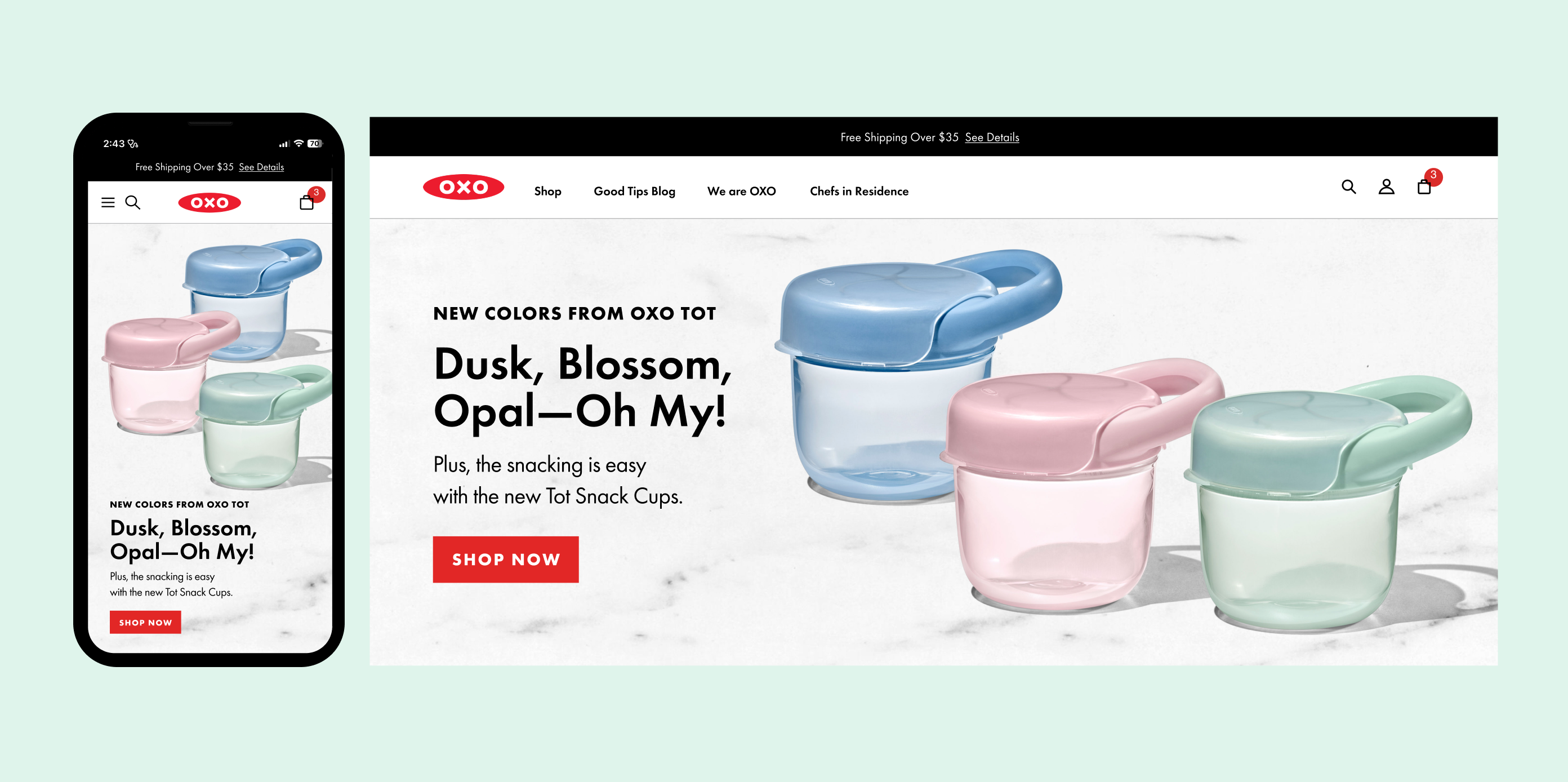
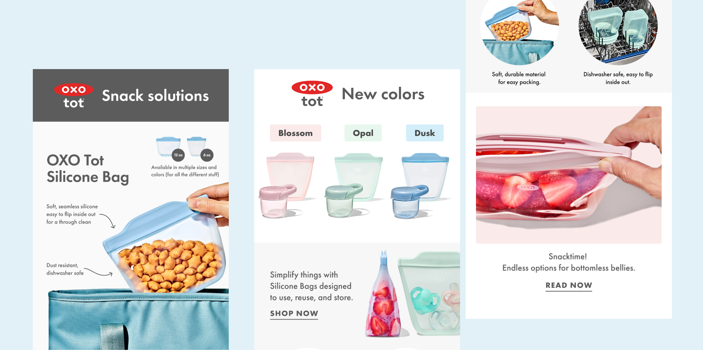
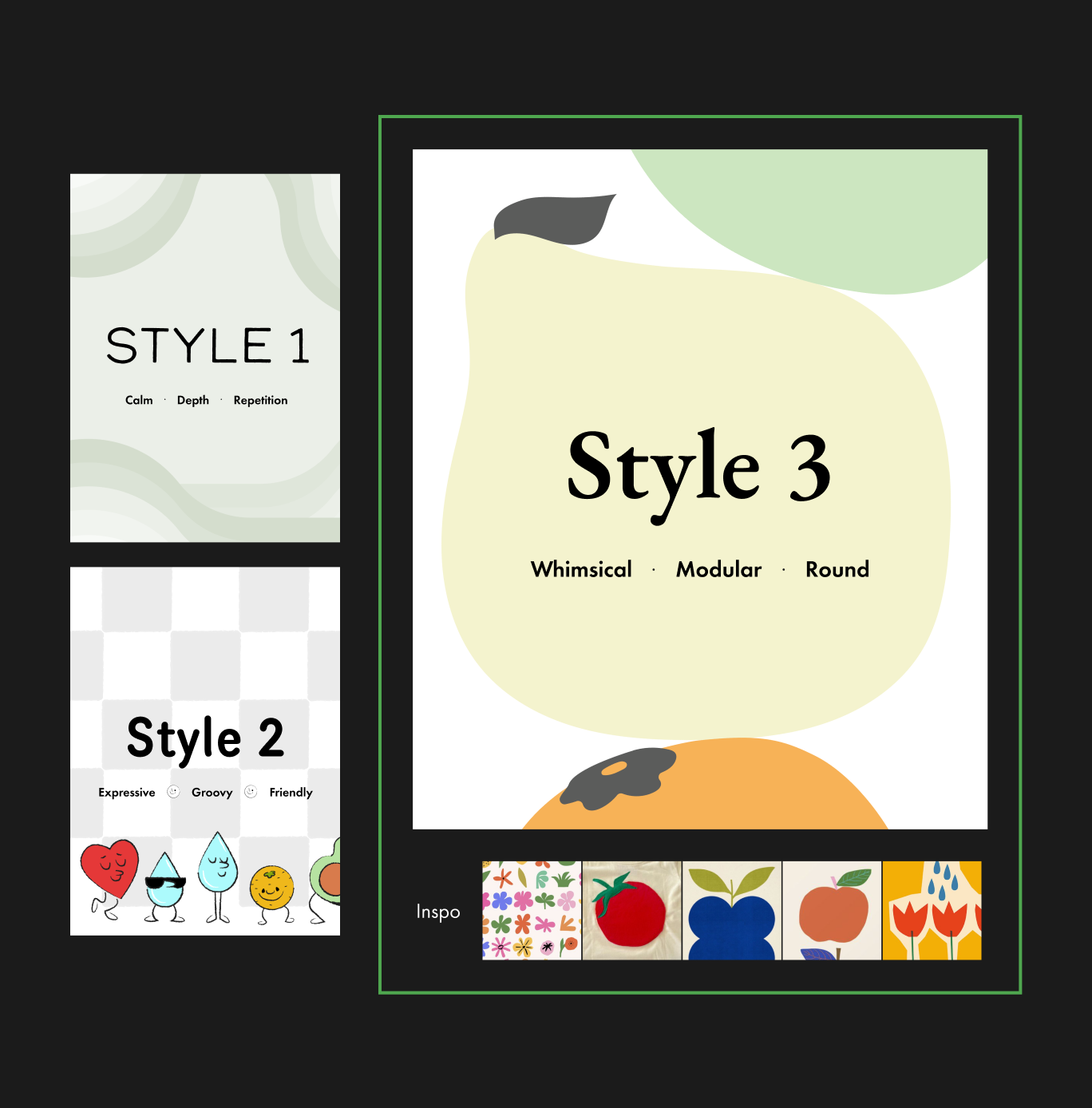
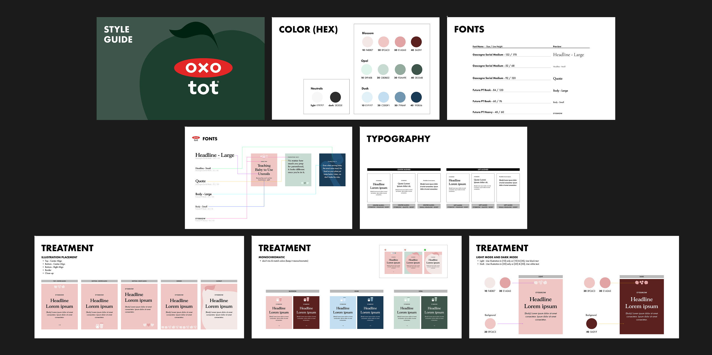
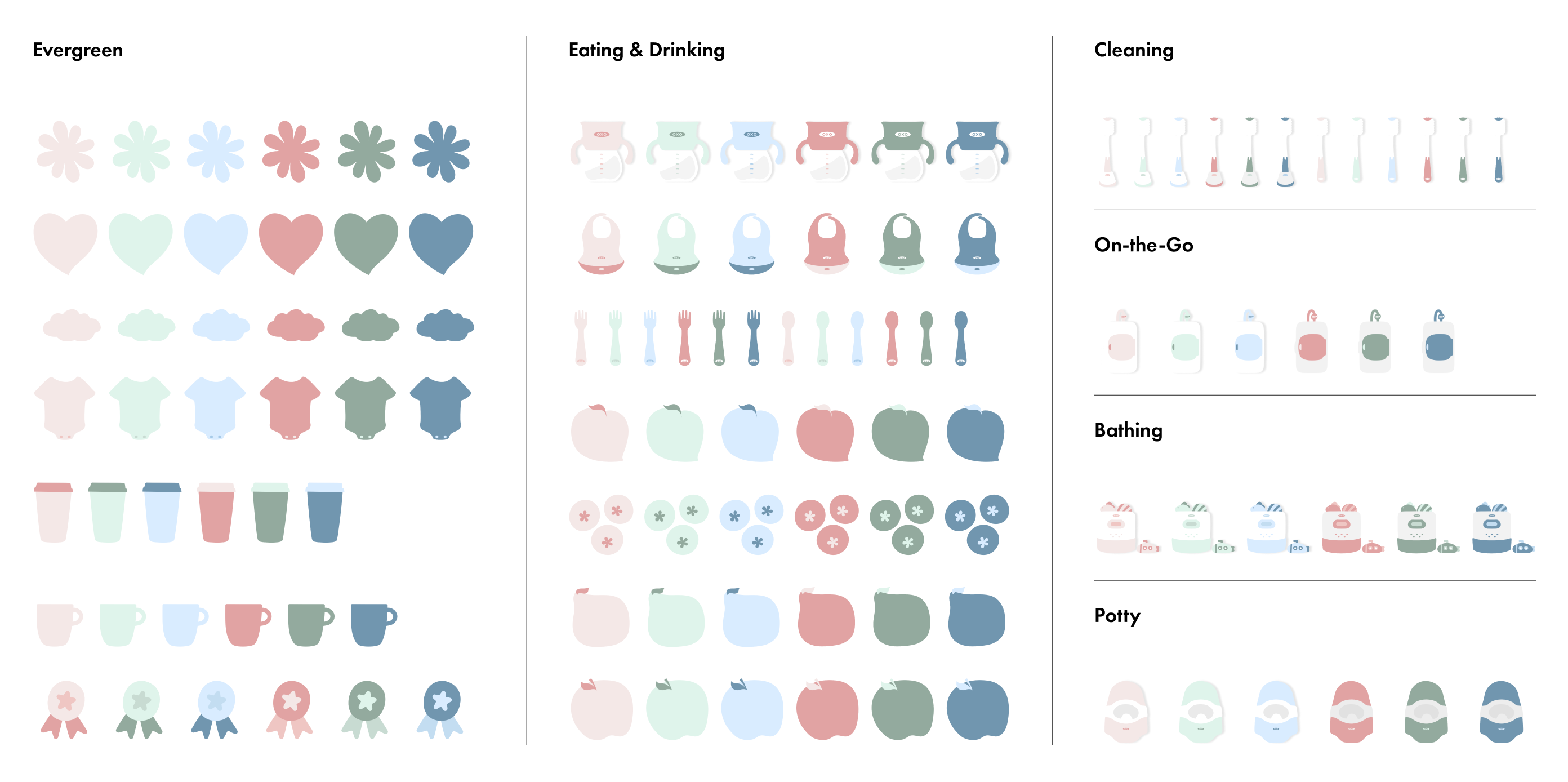
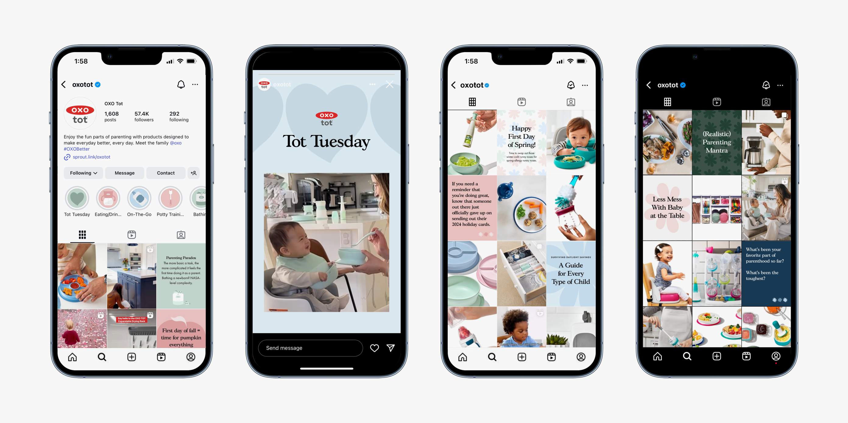
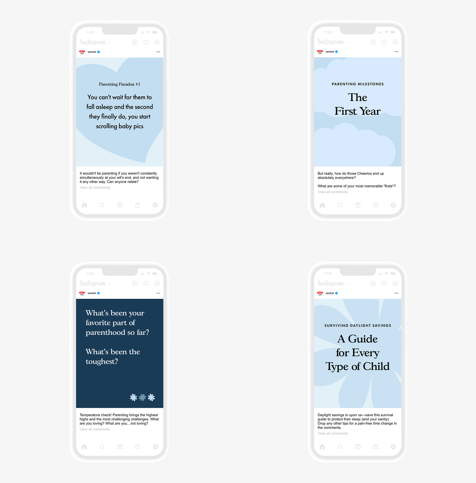
To meet the marketing objective of boosting engagement and keeping new parents in the brand’s ecosystem, I developed graphics scaled for relatable quote posts and infographics. I proposed 3 distinct styles to align with the teams and built a design system with color palettes, typography, layouts, hierarchy, and illustrations tied to the key categories. I also created a style guide and toolkit for internal and external teams to alleviate design resource and streamline the workflow. Within a month of launch, the refreshed posts drove higher saves and follower growth.

Credit
Photography: OXO In-House Brand Design Team
Photography: OXO In-House Brand Design Team